
Supernormal Systems era
Built with
- Figma
- Webflow
- WordPress migration
Fresh energy for an established payments company.
Novatti is an established, ASX-listed Australian payments company. The brief was to bring fresh visual energy to the brand while retaining the credibility and reassurance that came with its history. Brand strategy, identity and a new website formed one connected project.
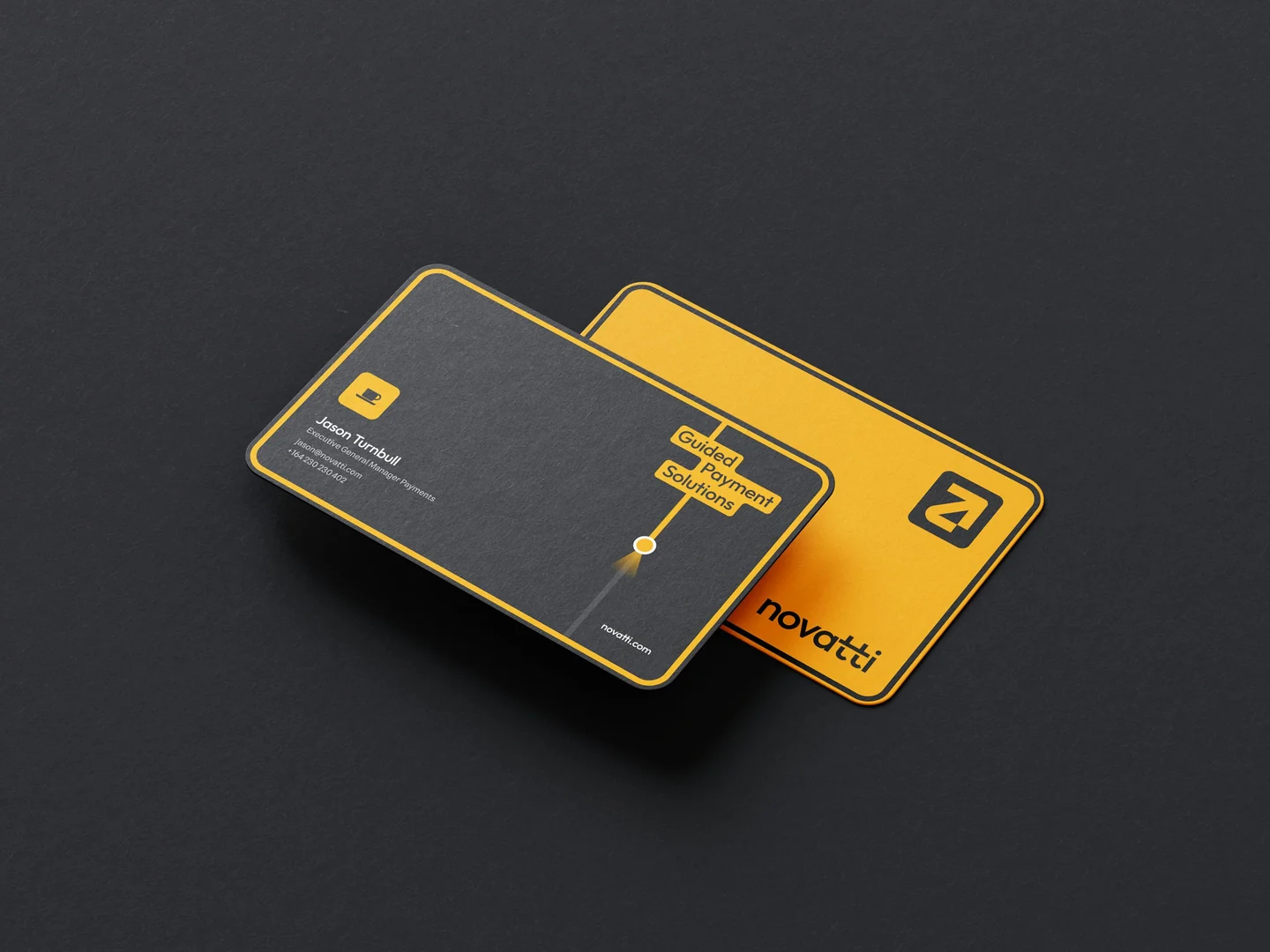
The central idea was guiding businesses through payments. GPS and map motifs made that idea visible: a yellow path leads through information, highlights a point and arrives at the main message. Directional arrows, windows and a location marker gave the identity a vocabulary for showing the way.
The visual balance mattered. Solid neutral foundations carried the sense of an established company; a warm yellow accent introduced energy and a clear direction through each composition. The system could feel welcoming while keeping the confidence expected of a payments partner.
The delivered brand and storytelling guides carried the idea beyond the logo. The customer is the protagonist and Novatti is the guide, with direction for applying that relationship through narrative and motion. The new website gave the refreshed identity a place to work across the company’s payments offering.
Guidance became a visual language.
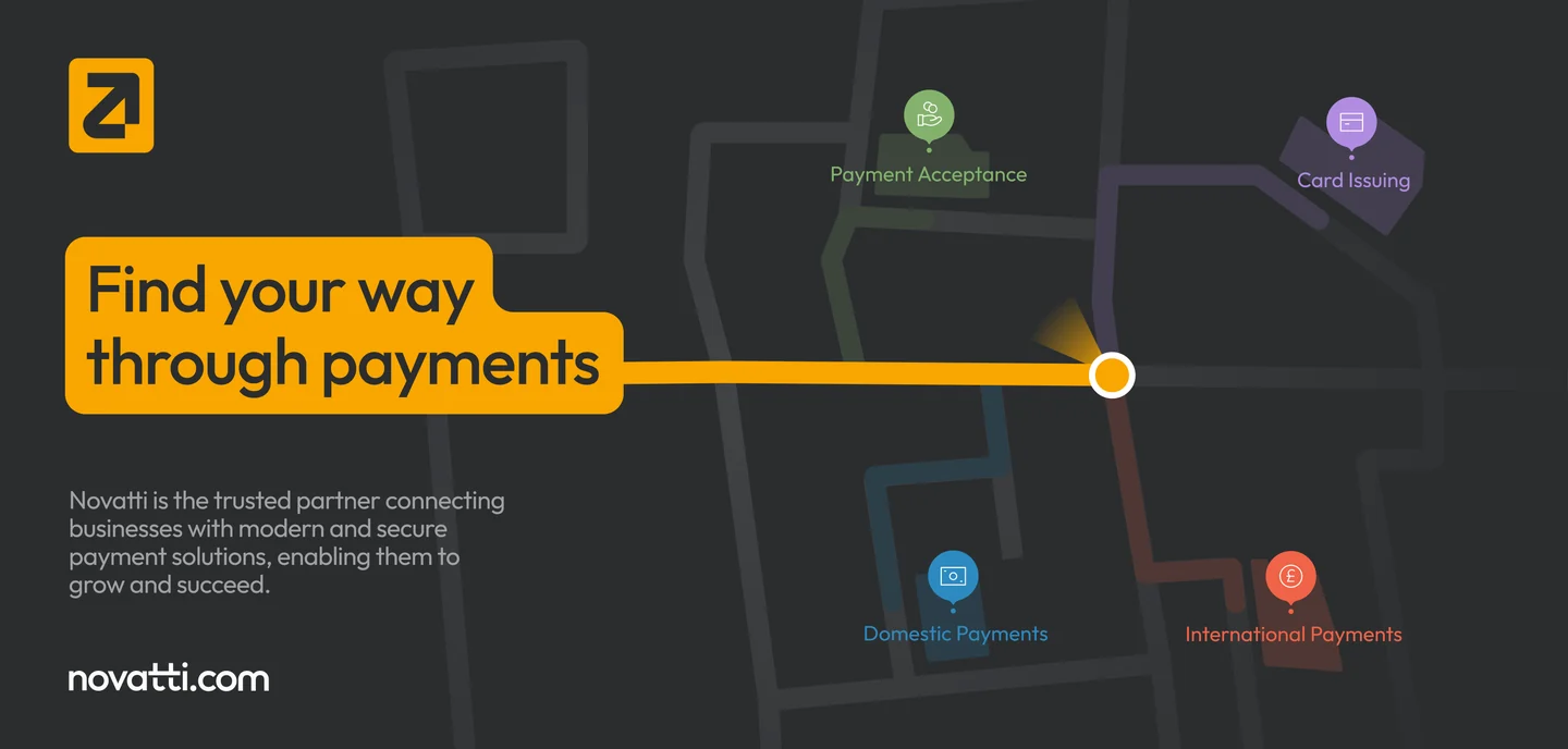
A scroll through the Novatti website.
Preview unavailable. Explore the screens above.
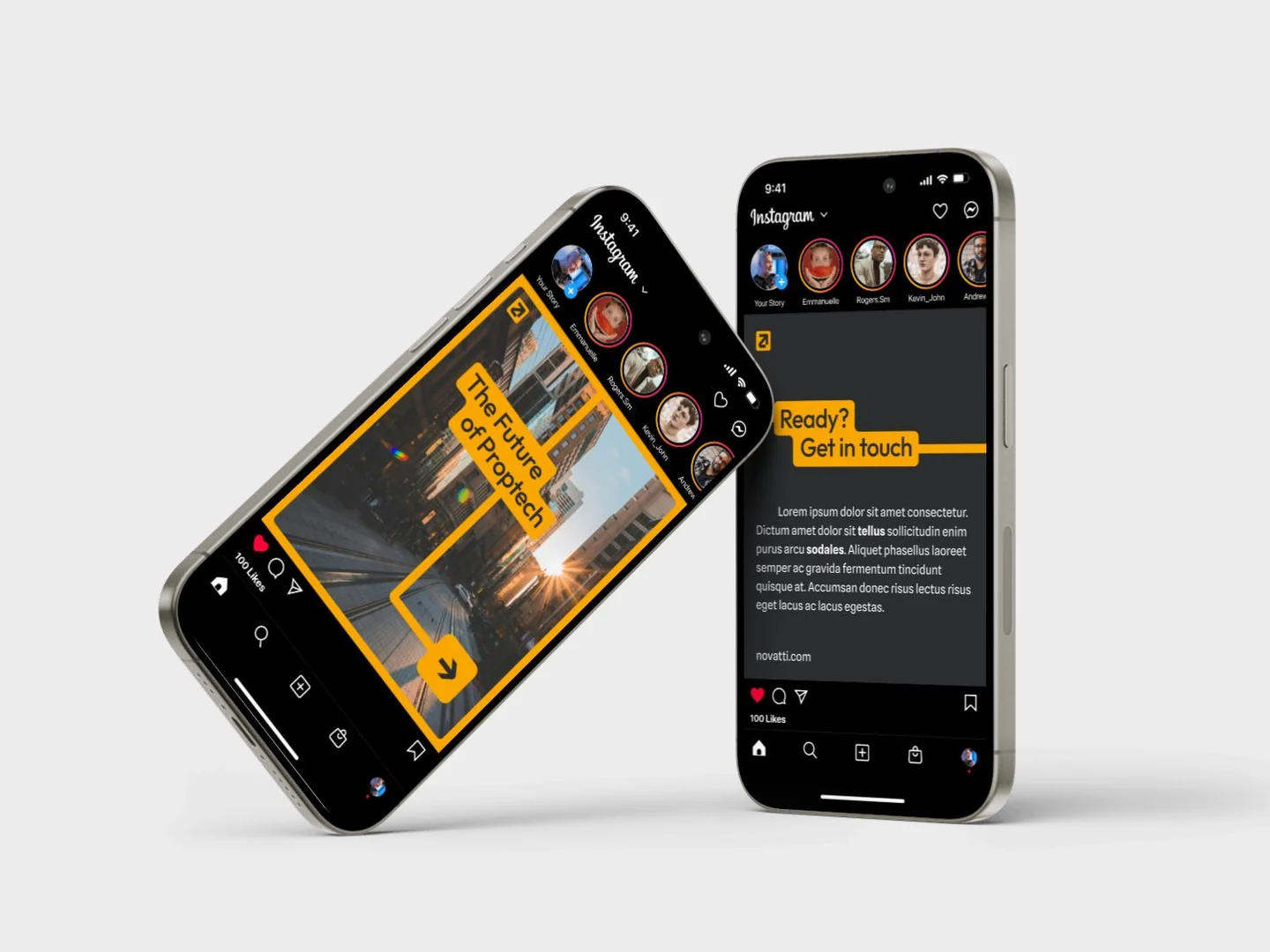
Brand gallery: delivered signage, print and social-template mockups.
Delivered as Solutions Architect at Supernormal Systems.
If your business needs a clearer way to tell its story, happy to talk it through. Book a call.